
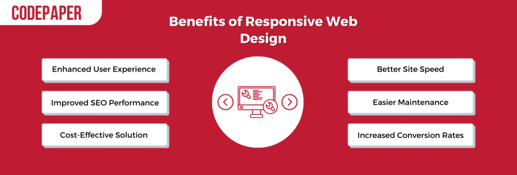
Introduction: Why Responsive Web Design Still Matters in 2025
In 2025, responsive web design is no longer a trend—it is a necessity. With over 65% of users browsing on mobile devices and Google’s mobile-first indexing fully enforced, having a mobile-optimized website is essential for visibility, user engagement, and SEO performance. Responsive web design ensures your site adapts seamlessly across desktops, tablets, and smartphones, enhancing the user experience (UX) while aligning with search engine algorithms.
At Codepaper, a leading Toronto web design company, we combine industry-leading UX principles with mobile-first development to ensure your site performs flawlessly—no matter the device.

1. Embrace a Mobile-First Strategy
Why It Matters: Mobile traffic accounts for the majority of internet usage globally. Designing for mobile-first ensures that the most constrained experiences are optimized before scaling up.
Best Practices:
- Start with mobile wireframes and scale upward
- Use flexible grids and fluid layouts
- Prioritize content hierarchy for small screens
Explore how our Custom Software Development Services support mobile-first architecture for scalable web solutions.
2. Use Scalable Vector Graphics (SVGs)
Why It Matters: SVGs maintain crispness and quality regardless of screen size or resolution. They load faster and scale better than raster images (JPG, PNG).
Best Practices:
- Replace icons and logos with SVG versions
- Use inline SVGs for better CSS control
- Optimize SVGs using tools like SVGO
For deeper technical insight, read Kinsta’s guide on optimizing website images.
3. Prioritize Performance and Speed
Why It Matters: Website speed significantly affects user experience, bounce rate, and SEO ranking. Google Core Web Vitals include performance metrics that directly influence search rankings.
Best Practices:
- Use lazy loading for images and videos
- Implement caching and minification (HTML, CSS, JS)
- Use next-gen formats like WebP
- Employ a CDN (Content Delivery Network)
Learn more from Neil Patel’s blog on reducing bounce rate through speed.
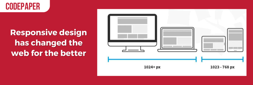
4. Flexible Grids and Fluid Layouts
Why It Matters: A fluid layout adjusts based on the user’s screen size. Grid systems such as CSS Grid or Flexbox are essential for creating responsive, scalable designs.
Best Practices:
- Avoid fixed units (e.g., px); use relative units (%, em, rem)
- Use media queries to create breakpoints
- Maintain consistent spacing and alignment
Tip: Use CSS clamp() function for dynamic font sizing based on viewport.
5. Accessible & Inclusive Design Principles
Why It Matters: Designing for accessibility ensures your website is usable by everyone, including people with disabilities. It also aligns with legal standards such as WCAG 2.2 and ADA compliance.
Best Practices:
- Use proper heading hierarchy (H1, H2, H3…)
- Add
alttext to images (e.g., ALT: “Responsive UI of Codepaper website on phone and tablet”) - Ensure color contrast ratios meet minimum standards
- Make all elements keyboard navigable
Need help implementing inclusive design? Learn more about our AI Consulting Services that support ethical and inclusive tech.
6. Optimized Typography and Readability
Why It Matters: Good typography improves UX by making content easier to scan, digest, and navigate.
Best Practices:
- Use responsive font sizes (via
clamp(),vw, orem) - Maintain proper line height (1.4–1.6x font size)
- Limit line length to 50–75 characters
- Use system fonts or variable fonts for performance
Explore our Application Modernization Services to modernize content delivery systems.
7. Test Responsiveness Across All Devices
Why It Matters: Just because a site looks good on an iPhone doesn’t mean it works well on a tablet or Samsung Galaxy. Testing ensures design consistency.
Best Practices:
- Use Chrome DevTools to simulate screen sizes
- Test with real devices for accuracy
- Use services like BrowserStack for cross-browser compatibility
Bonus: Try Google’s Mobile-Friendly Test Tool for a free audit.

8. Implement Smart Navigation for Mobile
Why It Matters: On mobile devices, navigation should be simple, intuitive, and unobtrusive.
Best Practices:
- Use hamburger menus or collapsible nav bars
- Keep navigation elements within reach of thumbs
- Limit top-level items to 5–7 links
- Make CTAs large and tappable
Want scalable mobile-friendly UI? Our DevOps Services integrate iterative design updates through CI/CD.
9. Ensure Content Hierarchy and Flow
Why It Matters: A clear visual hierarchy helps users find key information quickly and supports content scanning behaviors.
Best Practices:
- Use clear headings and subheadings
- Prioritize above-the-fold messaging
- Keep paragraphs short and use bullet lists
- Highlight CTAs with contrast and spacing
Need conversion-focused content strategy? Hire our expert web team today.
10. Leverage Progressive Web App (PWA) Capabilities
Why It Matters: PWAs offer the best of both web and mobile apps—fast load times, offline access, and push notifications.
Best Practices:
- Enable service workers for caching
- Use a web app manifest
- Optimize loading with skeleton screens
- Add install-to-home-screen prompts
Our Mobile App Development Services support full-scale PWA creation.
Call-to-action buttons

Call-to-action buttons are key in web design. They prompt users to take desired actions, such as making a purchase or signing up for a newsletter. To get the most out of them, there are some tips to follow:
- Position the buttons prominently.
- Make them noticeable with contrasting colors.
- Keep the text clear and short.
- Ensure the buttons are large enough.
- Place important ones above the fold.
- Integrate across multiple channels.
Don’t overwhelm users with too many buttons. Also, analyze performance and adjust the buttons based on user behavior. Toronto-based web design agency, Codepaper, understands the importance of effective call-to-action buttons for engaging users and increasing conversion rates.
Testing: Crossroads of Compatibility
Intersecting with compatibility is the vital aspect of testing. It involves analysing extensively to ensure smooth performance and optimal functioning across various platforms, devices and browsers. With so many options for users, testing is an essential step for responsive web design success.
Several factors come into play to assess: screen size, resolution capabilities, navigation features, and more. By testing codes, developers can identify and fix any compatibility issues.
To understand testing in terms of compatibility better, here’s a table outlining its main aspects:
| Compatibility Aspects | Description |
| Platform | Ensuring the website runs well on different operating systems, like Windows, iOS, Android, etc. |
| Browser | Checking for compatibility across popular browsers, such as Chrome, Firefox, Safari, etc. |
| Device | Optimising performance for various devices, including desktops, laptops, tablets and smartphones. |
| Screen Resolution | Adapting visuals to fit different screen resolutions for improved user experience. |
Though these are key for cross-compatibility in responsive web design, there are other details to look at to guarantee smooth functioning across all platforms. Testing must be done regularly as technology advances quickly. New updates and innovations happen often, so testing ensures websites stay compatible with current trends and keep their intended functionality.
A good example of the importance of thorough compatibility testing is a well-known e-commerce site that did not do this when changing their website. They included various features without thinking of cross-platform compatibility. When they launched the new version, it was full of bugs and issues on various devices and browsers. This mistake caused them to lose user trust and money, demonstrating the essential job of compatibility testing.
Challenges: Taming the Responsive Beast
Taming the dynamic nature of responsive web design is essential. Design strategies and techniques can help create a website that adapts to different screens and resolutions, while delivering a consistent user experience.
To tackle the challenges, here’s a table of some key ones:
| Challenge | Description |
| Flexible Layout | Adapting fluidly to screens |
| Content Prioritization | Determining which content is most important |
| Navigation | Intuitive menus for all devices |
| Optimization | Optimizing media for mobile performance |
Other considerations include efficient code and minimizing HTTP requests. With the right approach, a seamless user experience can be achieved across all devices.
The history of web development has seen many advances. From basic layouts to media queries and flexible grids, the evolution continues. With each breakthrough, developers are better equipped for responsive web design.
SEO: The Search for Excellence
Achieving greatness through search engine optimization (SEO)? It’s possible! SEO is all about getting higher rankings in search results. Strategies like keyword research and content optimization boost visibility. Further, technical aspects such as website speed, mobile responsiveness, user-friendly navigation, and relevant meta tags all help with the search experience.
Codepaper.com states that appropriate SEO techniques can give websites a major organic traffic boost and better online presence. Plus, adding call-to-action buttons is great for responsiveness. Ready to give it a try?
Conclusion: Future-Proof Your Website Design
Responsive web design in 2025 is about much more than just screen sizes. It’s a dynamic blend of performance, accessibility, content flow, and UX. By implementing these best practices, businesses can ensure their websites meet user expectations and search engine standards.
At Codepaper, we empower businesses to future-proof their digital presence through responsive, SEO-friendly, conversion-optimized websites. Whether you’re launching a startup site or modernizing an enterprise platform, our responsive web design services ensure your brand is always one step ahead.
Let’s build a responsive website that performs. Contact our Toronto Web Design Experts today!
FAQs
Q1: What is responsive web design?
A: Responsive web design is an approach that ensures websites adapt to various screen sizes, devices, and orientations to provide a consistent and optimal user experience.
Q2: How does responsive design affect SEO?
A: Google prioritizes mobile-first indexing, meaning mobile-optimized responsive sites rank higher. It also reduces bounce rate and improves dwell time, boosting your SEO performance.
Q3: What tools can I use to test responsiveness?
A: Tools like Chrome DevTools, BrowserStack, and Google’s Mobile-Friendly Test help developers simulate various devices and browsers for responsive checks.
Q4: Why is mobile-first design important?
A: Designing for mobile first ensures that critical content and features are prioritized on smaller screens, improving performance, usability, and accessibility.
Q5: Should I hire a web design company or do it in-house?
A: Hiring a professional team like Codepaper ensures expertise in modern web technologies, SEO alignment, UX optimization, and faster delivery.
